UTILITY PAGE
This page is to provide a quick guide to the components/modules available within the CMS. Each module type is divided by a dotted line and given a header to indicate what module and version you're seeing.
Module: Headers
Variation: Homepage Hero Options

This is a heading for Homepage Hero - Text Overlay Image
This is a paragraph for Homepage Hero - Text Overlay Image.
Learn MoreThis is a heading for Homepage Hero - Text Overlay Image
This is a paragraph for Homepage Hero - Text Overlay Image.
Learn MoreThis is a heading for Homepage Hero - Text Overlay Image. Tint.
This is a paragraph for Homepage Hero - Text Overlay Image. Tint.
Learn MoreThis is a heading for Homepage Hero - Text Overlay Image. Tint.
This is a paragraph for Homepage Hero - Text Overlay Image. Tint.
Learn MoreModule: Headers
Variation: Additional Header Options
This is the preheading to Header/CTA - Image + Text Container
Heading to Header/CTA-Image+Text Container. Container=red, half width.
This is the subheading to Header/CTA - Image + Text Container
This is the paragraph to Header/CTA - Image + Text Container. This example has the heading as H1, but you could make it H2 or H3. It shows up the same on the FE but will let adjusts the code so Google (SEO) knows what type of content to read it as.
Learn MoreThis is the preheading to Header/CTA - Image + Text Container
Heading to Header/CTA-Image+Text Container. Container=teal, 3/4 width.
This is the subheading to Header/CTA - Image + Text Container
This is the paragraph to Header/CTA - Image + Text Container. This example has the heading as H1, but you could make it H2 or H3. It shows up the same on the FE but will let adjusts the code so Google (SEO) knows what type of content to read it as.
Learn MoreThis is the preheading to Header/CTA - Image + Text Container
Heading Text | Container=light teal, 3/4 width, right, no image.
This is the subheading to Header/CTA - Image + Text Container
This is the paragraph to Header/CTA - Image + Text Container. This example has the heading as H1, but you could make it H2 or H3. It shows up the same on the FE but will let adjusts the code so Google (SEO) knows what type of content to read it as.
Learn MoreThis is the preheading to Header/CTA - Image + Text Container
Heading Text | Container=yellow, half width, left, tiled dot.
This is the subheading to Header/CTA - Image + Text Container
This is the paragraph to Header/CTA - Image + Text Container. This example has the heading as H1, but you could make it H2 or H3. It shows up the same on the FE but will let adjusts the code so Google (SEO) knows what type of content to read it as.
Learn MoreThis is the preheading to Header/CTA - Image + Text Container
Heading Text | Container=purple, half width, left, tiled dot.
This is the subheading to Header/CTA - Image + Text Container
This is the paragraph to Header/CTA - Image + Text Container. This example has the heading as H1, but you could make it H2 or H3. It shows up the same on the FE but will let adjusts the code so Google (SEO) knows what type of content to read it as.
Learn MoreThis is the preheading to Header/CTA - Image + Text Container
Heading Text | Container=navy blue, half width, left, tiled dot.
This is the subheading to Header/CTA - Image + Text Container
This is the paragraph to Header/CTA - Image + Text Container. This example has the heading as H1, but you could make it H2 or H3. It shows up the same on the FE but will let adjusts the code so Google (SEO) knows what type of content to read it as.
Learn MorePreheading for Callout Header
Paragraph for Callout Header. No image. White block. Half Width. Left align.
Learn MorePreheading for Callout Header
Paragraph for Callout Header. Red block. 3/4 Width. Left align.
Learn MorePreheading for Callout Header
Paragraph for Callout Header. Yellow block. 3/4 Width. Left align.
Learn MorePreheading for Callout Header
Paragraph for Callout Header. Teal block. 3/4 Width. Left align. Tiled dot.
Learn MorePreheading for Callout Header
Paragraph for Callout Header. Purple block. 3/4 Width. Right align. Tiled dot.
Learn MoreHeading for Header/CTA - Text Overlay
Paragraph for Header/CTA - Text Overlay. No image. Red Container. White shape, left align.
Learn MoreHeading for Header/CTA - Text Overlay
Paragraph for Header/CTA - Text Overlay. No image. Red Container. White shape, left align.
Learn MoreHeading for Header/CTA - Text Overlay
Paragraph for Header/CTA - Text Overlay. Image Tint. Light Teal Container. Blue shape, left align.
Learn MoreHeading for Header/CTA - Text Overlay
Paragraph for Header/CTA - Text Overlay. Centered Text. Image Tint. Yellow Container. Blue shape, right align.
Learn MoreHeading for Header/CTA - Text Overlay
Paragraph for Header/CTA - Text Overlay. Purple Container. White shape, left align.
Learn MoreHeading for Header/CTA - Text Overlay
Paragraph for Header/CTA - Text Overlay. Image Tint. Navy Blue Container. White shape, left align.
Learn MoreModule: RICH text
Variation: Boxed width
All text styles are controlled in two ways: 1. What the backend and SEO reads as an h1, h2, etc. 2. The way it shows up on the frontend (visually; what format the text takes regardless of 1.
This is an h4
This is an H2
This is an H1
This is an H3
This is an H5
This is an H6
This is body copy (normal). Lorem ipsum dolor sit amet, consectetur adipiscing elit. Cras vestibulum vitae dolor posuere eleifend. Donec non elementum tortor, id mattis tortor. Cras eget libero at mi sagittis posuere sit amet ut quam. Class aptent taciti sociosqu ad litora torquent per conubia nostra, per inceptos himenaeos. Integer eu elementum eros. Quisque ac egestas ante, in euismod orci. Suspendisse maximus libero convallis, porttitor mi eu, sagittis enim. In pretium, dolor id rhoncus auctor, arcu urna volutpat mi, id varius tellus orci vitae urna. Suspendisse ligula est, ornare nec nibh hendrerit, finibus maximus enim. Etiam nec congue est. Aliquam erat volutpat.
You can make text bold, italics, underlined.
Left align
Center align
Right align
You can add a bulleted list:
- A
- B
- C
- D
- E
- F
You can add a table:
| This is the heading of col 1 | This is the heading of col 2 |
|---|---|
| This is the first column, first row | Second column, first row |
| First column, second row | Second column, second row |
| First column, third row | Second column, third row |
You can add a blockquote:
Lorem ipsum dolor sit amet, consectetur adipiscing elit. Cras vestibulum vitae dolor posuere eleifend. Donec non elementum tortor, id mattis tortor. Cras eget libero at mi sagittis posuere sit amet ut quam. Class aptent taciti sociosqu ad litora torquent per conubia nostra, per inceptos himenaeos. Integer eu elementum eros. Quisque ac egestas ante, in euismod orci. Suspendisse maximus libero convallis, porttitor mi eu, sagittis enim. In pretium, dolor id rhoncus auctor, arcu urna volutpat mi, id varius tellus orci vitae urna. Suspendisse ligula est, ornare nec nibh hendrerit, finibus maximus enim. Etiam nec congue est. Aliquam erat volutpat.
There are a few ways you can add links/buttons:
You can choose font colors:
Purple (Light)
Purple
Teal (Light)
Teal (Dark)
Teal
Grey
Grey (Light)
Grey (Medium)
Black
Blue (Navy)
Blue (Midnight)
Red
Yellow
You can create an image or video caption:
This is a caption for a video
This is a caption for an image
Module: RICH text
Variation: Full width
All text styles are controlled in two ways: 1. What the backend and SEO reads as an h1, h2, etc. 2. The way it shows up on the frontend (visually; what format the text takes regardless of 1.
This is an h4
This is an H2
This is an H1
This is an H3
This is an H5
This is an H6
This is body copy (normal). Lorem ipsum dolor sit amet, consectetur adipiscing elit. Cras vestibulum vitae dolor posuere eleifend. Donec non elementum tortor, id mattis tortor. Cras eget libero at mi sagittis posuere sit amet ut quam. Class aptent taciti sociosqu ad litora torquent per conubia nostra, per inceptos himenaeos. Integer eu elementum eros. Quisque ac egestas ante, in euismod orci. Suspendisse maximus libero convallis, porttitor mi eu, sagittis enim. In pretium, dolor id rhoncus auctor, arcu urna volutpat mi, id varius tellus orci vitae urna. Suspendisse ligula est, ornare nec nibh hendrerit, finibus maximus enim. Etiam nec congue est. Aliquam erat volutpat.
You can make text bold, italics, underlined.
Left align
Center align
Right align
You can add a bulleted list:
- A
- B
- C
- D
- E
- F
You can add a table:
| This is the heading of col 1 | This is the heading of col 2 |
|---|---|
| This is the first column, first row | Second column, first row |
| First column, second row | Second column, second row |
| First column, third row | Second column, third row |
You can add a blockquote:
Lorem ipsum dolor sit amet, consectetur adipiscing elit. Cras vestibulum vitae dolor posuere eleifend. Donec non elementum tortor, id mattis tortor. Cras eget libero at mi sagittis posuere sit amet ut quam. Class aptent taciti sociosqu ad litora torquent per conubia nostra, per inceptos himenaeos. Integer eu elementum eros. Quisque ac egestas ante, in euismod orci. Suspendisse maximus libero convallis, porttitor mi eu, sagittis enim. In pretium, dolor id rhoncus auctor, arcu urna volutpat mi, id varius tellus orci vitae urna. Suspendisse ligula est, ornare nec nibh hendrerit, finibus maximus enim. Etiam nec congue est. Aliquam erat volutpat.
There are a few ways you can add links/buttons:
You can choose font colors:
Purple (Light)
Purple
Teal (Light)
Teal (Dark)
Teal
Grey
Grey (Light)
Grey (Medium)
Black
Blue (Navy)
Blue (Midnight)
Red
Yellow
You can create an image or video caption:
This is a caption for a video
This is a caption for an image
Module: Cards
See individual cards for details of that variation. Cards are used in sliders and card containers.
NOTE: We are using the Slider Container component to show all card variations in one place, another part of this page will provide details on the slider container and its corresponding variations.

This is preheading text to Card - Image top, text bottom
This is heading text to Card - Image top, text bottom
The preheading text is limited to 70 characters. The heading text is limited to 70 characters. The Paragraph text is limited to 250 characters.
This is a link text
This is the heading text set to H2 on Card - Colored background
This is the card paragraph. This card is white with an image.
Learn More This is the heading text set to H3 on Card - Colored background
This is the card paragraph. This card is red with an image. When using a red background, we recommend making the text white.
Learn More This is the heading text set to H3 on Card - Colored background
This is the card paragraph. This card is purple with an image. When using a purple background, we recommend making the text white.
Learn More This is the heading text set to H4 on Card - Colored background
This is the card paragraph. This card is yellow with an image.
Learn More This is the heading text set to H4 on Card - Colored background
This is the card paragraph. This card is yellow with an image and white text.
Learn More This is the heading text set to H4 on Card - Colored background
This is the card paragraph. This card is yellow with an image.
Learn More This is the heading text set to H4 on Card - Colored background
This is the card paragraph. This card is yellow with an image and white text.
Learn MoreModule: Additional Cards and cards container
These are additional card styles in a cards container as we do not recommend putting these types of cards into a slider.
Preheader text for Cards Container. 2 Column.
Heading text for Cards Container. 2 Column.
This is preheading text to Card - Image top, text bottom
This is heading text to Card - Image top, text bottom
The preheading text is limited to 70 characters. The heading text is limited to 70 characters. The Paragraph text is limited to 250 characters.
This is a link textThis is preheading text to Card - Image top, text bottom. No image.
This is heading text to Card - Image top, text bottom. No image.
The preheading text is limited to 70 characters. The heading text is limited to 70 characters. The Paragraph text is limited to 250 characters.
This is a link textPreheader text for Cards Container. 3 Column.
Heading text for Cards Container. 3 Column.
This is preheading text to Card - Image top, text bottom
This is heading text to Card - Image top, text bottom
The preheading text is limited to 70 characters. The heading text is limited to 70 characters. The Paragraph text is limited to 250 characters.
This is a link text This is preheading text to Card - Image top, text bottom
This is heading text to Card - Image top, text bottom
The preheading text is limited to 70 characters. The heading text is limited to 70 characters. The Paragraph text is limited to 250 characters.
This is a link textThis is preheading text to Card - Image top, text bottom. No image.
This is heading text to Card - Image top, text bottom. No image.
The preheading text is limited to 70 characters. The heading text is limited to 70 characters. The Paragraph text is limited to 250 characters.
This is a link textPreheader text for Cards Container. 3 Column. 4+ Cards/Results.
Heading text for Cards Container. 3 Column. 4+ Cards/Results.
This is preheading text to Card - Image top, text bottom
This is heading text to Card - Image top, text bottom
The preheading text is limited to 70 characters. The heading text is limited to 70 characters. The Paragraph text is limited to 250 characters.
This is a link text This is preheading text to Card - Image top, text bottom
This is heading text to Card - Image top, text bottom
The preheading text is limited to 70 characters. The heading text is limited to 70 characters. The Paragraph text is limited to 250 characters.
This is a link textThis is preheading text to Card - Image top, text bottom. No image.
This is heading text to Card - Image top, text bottom. No image.
The preheading text is limited to 70 characters. The heading text is limited to 70 characters. The Paragraph text is limited to 250 characters.
This is a link textThis is preheading text to Card - Image top, text bottom. No image.
This is heading text to Card - Image top, text bottom. No image.
The preheading text is limited to 70 characters. The heading text is limited to 70 characters. The Paragraph text is limited to 250 characters.
This is a link textPreheader text for Cards Container. 4 Column. 4+ Cards/Results.
Heading text for Cards Container. 4 Column. 4+ Cards/Results.
This is preheading text to Card - Image top, text bottom
This is heading text to Card - Image top, text bottom
The preheading text is limited to 70 characters. The heading text is limited to 70 characters. The Paragraph text is limited to 250 characters.
This is a link text This is preheading text to Card - Image top, text bottom
This is heading text to Card - Image top, text bottom
The preheading text is limited to 70 characters. The heading text is limited to 70 characters. The Paragraph text is limited to 250 characters.
This is a link text This is preheading text to Card - Image top, text bottom
This is heading text to Card - Image top, text bottom
The preheading text is limited to 70 characters. The heading text is limited to 70 characters. The Paragraph text is limited to 250 characters.
This is a link textThis is preheading text to Card - Image top, text bottom. No image.
This is heading text to Card - Image top, text bottom. No image.
The preheading text is limited to 70 characters. The heading text is limited to 70 characters. The Paragraph text is limited to 250 characters.
This is a link textThis is preheading text to Card - Image top, text bottom. No image.
This is heading text to Card - Image top, text bottom. No image.
The preheading text is limited to 70 characters. The heading text is limited to 70 characters. The Paragraph text is limited to 250 characters.
This is a link textModule: Accordion
Variation: See details in each accordion item
Preheader to Accordion Container
Heading (These can be center, left, or right aligned)
Preheader for a 2 column Module in an Accordion Item
Heading for a 2 column Module in an Accordion Item
This two column module is set to 50/50. That's why our image and text take up the same amount of space here.
Lorem ipsum
Lorem ipsum dolor sit amet, consectetur adipiscing elit. Nunc at lacinia lacus. Ut dui nisl, blandit quis mollis eget, efficitur a nunc. Vivamus commodo quam vitae lacus interdum, in convallis arcu gravida. Nullam pretium eget diam sed convallis. Phasellus dolor tortor, tristique a sem hendrerit, ultricies blandit ligula. Sed sit amet dapibus turpis.
Preheader for a 2 column Module in an Accordion Item
Heading for a 2 column Module in an Accordion Item
This two column module is set to 33/66.
Lorem ipsum
Lorem ipsum dolor sit amet, consectetur adipiscing elit. Nunc at lacinia lacus. Ut dui nisl, blandit quis mollis eget, efficitur a nunc. Vivamus commodo quam vitae lacus interdum, in convallis arcu gravida. Nullam pretium eget diam sed convallis. Phasellus dolor tortor, tristique a sem hendrerit, ultricies blandit ligula. Sed sit amet dapibus turpis.
Preheader for a 2 column Module in an Accordion Item. Text left.
Heading for a 2 column Module in an Accordion Item. Text left.
This two column module is set to 66/33.
Lorem ipsum
Lorem ipsum dolor sit amet, consectetur adipiscing elit. Nunc at lacinia lacus. Ut dui nisl, blandit quis mollis eget, efficitur a nunc. Vivamus commodo quam vitae lacus interdum, in convallis arcu gravida. Nullam pretium eget diam sed convallis. Phasellus dolor tortor, tristique a sem hendrerit, ultricies blandit ligula. Sed sit amet dapibus turpis.
Preheader for a 2 column Module in an Accordion Item. Text left. Swap
Heading for a 2 column Module in an Accordion Item. Text left. Swap
This is the same as the previous accordion section, but I have swapped the location of the rich text and image elements
Lorem ipsum
Lorem ipsum dolor sit amet, consectetur adipiscing elit. Nunc at lacinia lacus. Ut dui nisl, blandit quis mollis eget, efficitur a nunc. Vivamus commodo quam vitae lacus interdum, in convallis arcu gravida. Nullam pretium eget diam sed convallis. Phasellus dolor tortor, tristique a sem hendrerit, ultricies blandit ligula. Sed sit amet dapibus turpis.
Preheader for a 2 column Module in an Accordion Item. Right text. Card
Heading for a 2 column Module in an Accordion Item. Right text. Card
this shows a 66/33 two column module with rich text on one side and a card on the other.
Lorem ipsum
Lorem ipsum dolor sit amet, consectetur adipiscing elit. Nunc at lacinia lacus. Ut dui nisl, blandit quis mollis eget, efficitur a nunc. Vivamus commodo quam vitae lacus interdum, in convallis arcu gravida. Nullam pretium eget diam sed convallis. Phasellus dolor tortor, tristique a sem hendrerit, ultricies blandit ligula. Sed sit amet dapibus turpis.
This is the heading text set to H3 on Card - Colored background
This is the card paragraph. This card is red with an image. When using a red background, we recommend making the text white.
Learn Morethis is an accordion section with just a rich text block inside. Remember, you still have all controls shown above in rich text within this block.
Lorem ipsum
Lorem ipsum dolor sit amet, consectetur adipiscing elit. Nunc at lacinia lacus. Ut dui nisl, blandit quis mollis eget, efficitur a nunc. Vivamus commodo quam vitae lacus interdum, in convallis arcu gravida. Nullam pretium eget diam sed convallis. Phasellus dolor tortor, tristique a sem hendrerit, ultricies blandit ligula. Sed sit amet dapibus turpis.
this is an accordion section with A rich text block and an iframe. I've pulled a form into the iframe for example. Remember that with iframes all you need is the URL of what you're feeding in. From there, you can choose how large the iframe is (i made the one below 600px)
Lorem ipsum
Lorem ipsum dolor sit amet, consectetur adipiscing elit. Nunc at lacinia lacus. Ut dui nisl, blandit quis mollis eget, efficitur a nunc. Vivamus commodo quam vitae lacus interdum, in convallis arcu gravida. Nullam pretium eget diam sed convallis. Phasellus dolor tortor, tristique a sem hendrerit, ultricies blandit ligula. Sed sit amet dapibus turpis.
Module: Slider
Variation: Manually Related Content (you choose exactly what shows up in these cards). Notice in the 2 column example below, we have arrows and pagination, that's because I've added 3 cards but it's a 2 card view. This is designed to happen by default. You could add as many cards to a slider as you'd like and it will always show as many as you've indicated in the layout settings.
This is preheading text to Card - Image top, text bottom
This is heading text to Card - Image top, text bottom
The preheading text is limited to 70 characters. The heading text is limited to 70 characters. The Paragraph text is limited to 250 characters.
This is a link text This is preheading text to Card - Image top, text bottom
This is heading text to Card - Image top, text bottom
The preheading text is limited to 70 characters. The heading text is limited to 70 characters. The Paragraph text is limited to 250 characters.
This is a link text This is preheading text to Card - Image top, text bottom
This is heading text to Card - Image top, text bottom
The preheading text is limited to 70 characters. The heading text is limited to 70 characters. The Paragraph text is limited to 250 characters.
This is a link text This is preheading text to Card - Image top, text bottom
This is heading text to Card - Image top, text bottom
The preheading text is limited to 70 characters. The heading text is limited to 70 characters. The Paragraph text is limited to 250 characters.
This is a link text This is preheading text to Card - Image top, text bottom
This is heading text to Card - Image top, text bottom
The preheading text is limited to 70 characters. The heading text is limited to 70 characters. The Paragraph text is limited to 250 characters.
This is a link text This is preheading text to Card - Image top, text bottom
This is heading text to Card - Image top, text bottom
The preheading text is limited to 70 characters. The heading text is limited to 70 characters. The Paragraph text is limited to 250 characters.
This is a link text

Module: Slider
Variation: Dynamic Related Content (you choose to pull in a certain content type tagged with certain fields). See details below and reference document for how-to instructions.
Module: AUDIO EMBED
There is 1 audio embed component, but it can be used as full-width or within other elements like a two-column grid, accordion, etc. Audio components pull in audio that is uploaded into the CMS.
Preheader to Two Column Module with Audio Inside
Heading to Two Column Module with Audio Inside
example
Audio used in a two column module.
I have added a two column module. Within this column, this is a rich text box with an audio component under it. In the other column, I have dropped in an image component.
Rich text Pre header
Rich Text Headline
Rich text body copy. Lorem ipsum dolor sit amet, consectetur adipiscing elit. Integer vulputate enim et eros congue fermentum. Nullam interdum tortor lacus, eu viverra eros finibus id. Curabitur vulputate neque et pellentesque laoreet. Fusce nec facilisis leo. Mauris facilisis pellentesque massa eu fermentum. Sed eu lacus lacus. Integer dapibus et ante et ultricies. Suspendisse non dui vel ipsum commodo cursus vitae tempor ex. Morbi fermentum, turpis vitae ullamcorper viverra, libero dolor tristique nibh, non aliquet nulla enim vitae magna. Donec hendrerit malesuada sem, ut faucibus nisl suscipit vel.
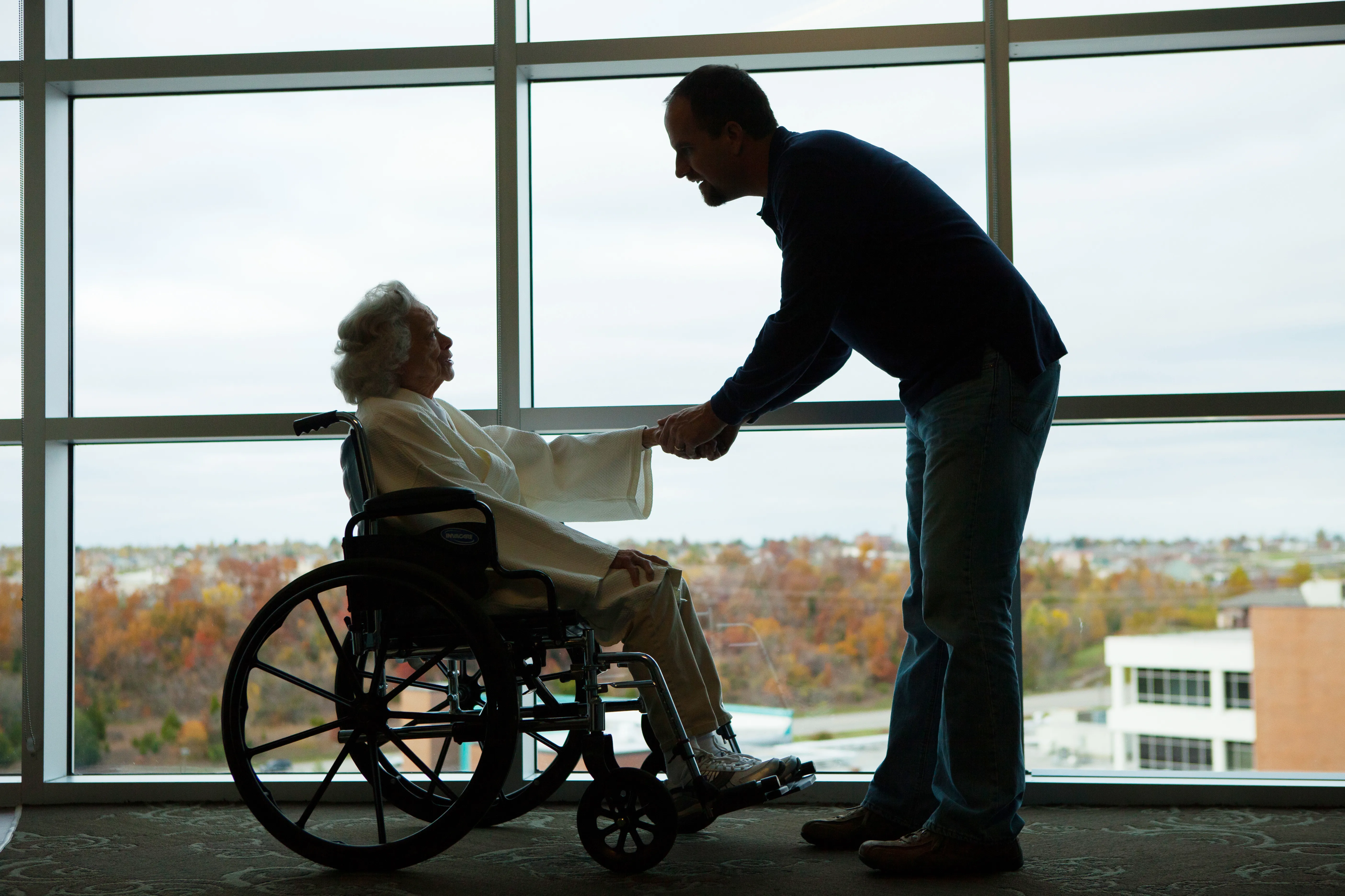
Module: Image
Up until now we've seen images used throughout the site, but in addition to using them in the modules above, an image can be dropped almost anywhere on a page. The examples below show it dropped as is on the page. See accordion, cards, and two column grid modules for more examples of image usage.

Module: Video
Variation: CMS Upload | Example 1 is full width & example 2 is boxed width

Module: Video
Variation: YouTube video
This module is used when you've entered a YouTube video link into the corresponding field for this page. If you add a link there but do not add this module, the video will not pull in. NOTE: It pulls in the same preview image you have on the YouTube video itself. If the image is not very good, please update the YouTube video and this module should automatically update.